Brand guide
TapBae is playful, polished and approachable. Always write it as TapBae — capital T, capital B, no space.
One tap. All you.
Supporting line: “Your links. Your look. Your domain.”
Logo and icon
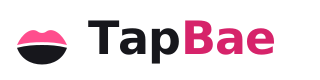
Wordmark on light backgrounds
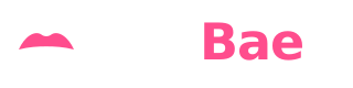
Wordmark on dark backgrounds
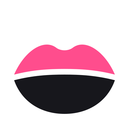
Compact icon — a pair of lips: TapBae Pink top lip, ink black bottom lip. No container needed; use for avatars and social profiles.
On dark backgrounds the bottom lip turns white. The favicon uses a dark squircle badge instead.





Colours
Dark
#111116
Midnight backgrounds
Light
#FFFFFF
Page background
TapBae Pink
#FF4D8D
Buttons and highlights
Soft Pink
#FFF0F6
Panels and section backgrounds
Ink
#17171C
Body text and text on pink buttons
Muted
#666675
Secondary text
Deep Pink
#D6236A
Pink text on white (readable contrast)
Pink buttons always carry dark ink text, never white. For pink text on a white background use Deep Pink so it stays readable.
Type
Baloo 2 — headings
Nunito — body text, buttons and labels
Rounded, friendly and generous. Keep plenty of space around headings and use large tap targets.
Motion
Buttons get a small springy press. Ripples are subtle and short. Nothing animated ever delays a tap or a page change, and all motion is switched off for anyone whose device asks for reduced motion.